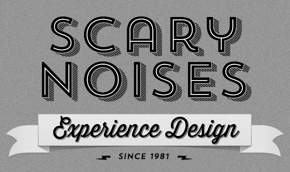
 I can’t resist the trend in design right now. You know the one I’m talking about—everything looks like it’s 1911 all over again. Technically, there are more geometric and grotesque typefaces, more of an emphasis on lettering (and type that looks like lettering), and lots of monochromatic design. I’ve temporarily ditched my site logo mark (the exclamation point with sound waves emanating) and just gone with the flow for now. Trends come and go but when one swells up that you happen to personally dig, you have to jump in before the wave is over.
What’s the significance of 1981? That’s not when I started this blog (that was 2004); it’s when I designed my first apps.