buuteeq
Design Concierge
2011 – 2012
BUSINESS PROBLEM
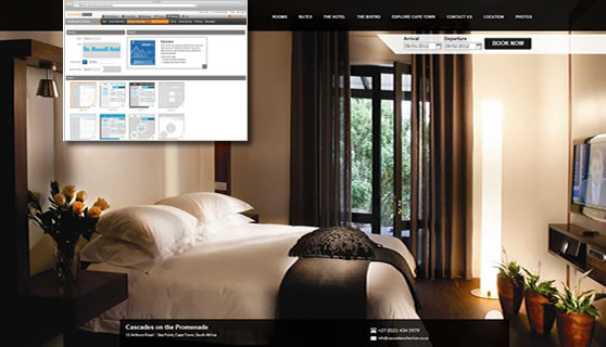
buuteeq is a startup that provides a SaaS platform to help hotels with their marketing. It includes a hotel-specific CMS that allows marketing managers and hoteliers to create and manage their own marketing content, desktop/mobile websites, and promotions. The original platform had been built by an agency in China, and although they had built out a pretty deep platform, the websites it created looked similar, had too many things for the customer support group to setup, and gave users too much leeway to make bad design decisions.
ROLE
Chief Experience Officer. I was hired to drive the design, usability, and usefulness of the products and to recruit and manage the UX, visual design, and front-end dev teams.
SOLUTION
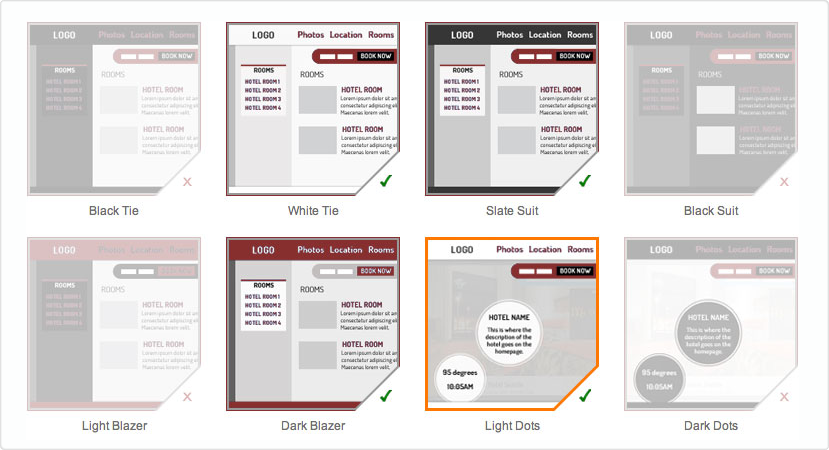
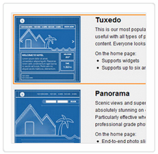
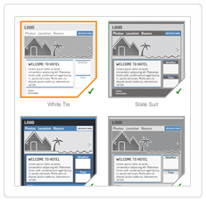
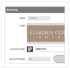
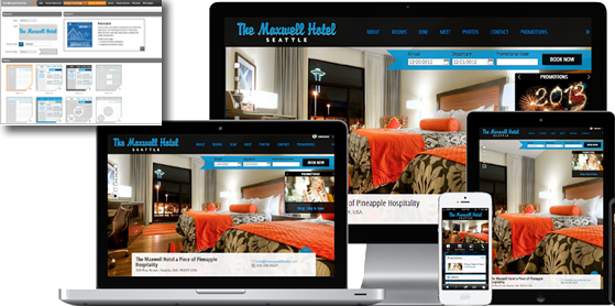
For this particular issue, I envisioned a three-tiered approach to templating that would give significant variety while limiting the types of choices that were causing users problems. The top tier was the Blueprint, the website archetype. The second tier was the Theme, the look and feel and color scheme of the site. The third tier was Branding Details—customization settings that are heavily pre-vetted to look good and work well together. The original system, for instance, had users (or customer support) attempting to pick thirteen independent colors that hopefully would work together. The new system asked them for a single Accent Color and then used alpha blends of black, white, and the accent color to render a more harmonious color palette. We similarly ran through hundreds of open source fonts to find good pairings and created the concept of an Accent Shape that would similarly add more variety while still guaranteed to fit with the rest of the site.
Interviewed the various stakeholders to find the real problems, analyzed the data, enumerated the goals, created an overview deck, created sketches, wireframes, and comps. Documented and illustrated the requirements and specs. Worked with designers, product managers, and developers to get the new system and the new Blueprints and Themes built.
RESULTS
Removed design as a blocker for the higher end market, doubling the customer base in a year. Reduced the time and complexity of branding new customers by half. Increased the general quality of sites by removing bad options. Cut design-related churn in half.
Macromedia (Adobe)
Flash Player, Flash MX 2004, Flex, FlexBuilder
2002 – 2004
BUSINESS PROBLEM
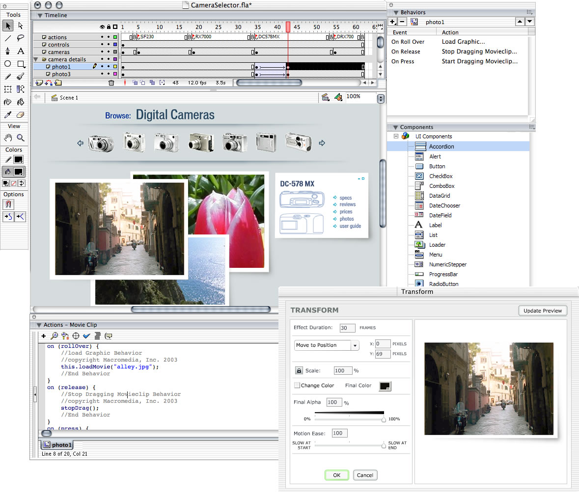
By the mid-2000’s, Flash had pretty much replaced Director as the premier way to add rich content to the web and was way ahead of HTML in what it could deliver. Everyone was pushing the envelope on what could be created and Macromedia needed tools that could keep up with increasingly demanding designers and developers. Flash was built on metaphors such as movie clips, frames, and timelines that were foreign to developers and so there were several diverging efforts to come up with a more appropriate foundation for building apps. In addition, Flash had just introduced video in its player but it only supported monolithic, downloaded video and although clearly promising, it hadn’t really caught on yet. I was the first product designer hired at Macromedia and I was the sole product designer on these projects.
ROLE
Sole Senior Product Designer for Flash player, Flash MX 2004, Flex, and FlexBuilder
Flash Leadership Team member
Cross-Product UI Team member (One of four members making user interface and application design decisions for the Studio suite)
SOLUTION
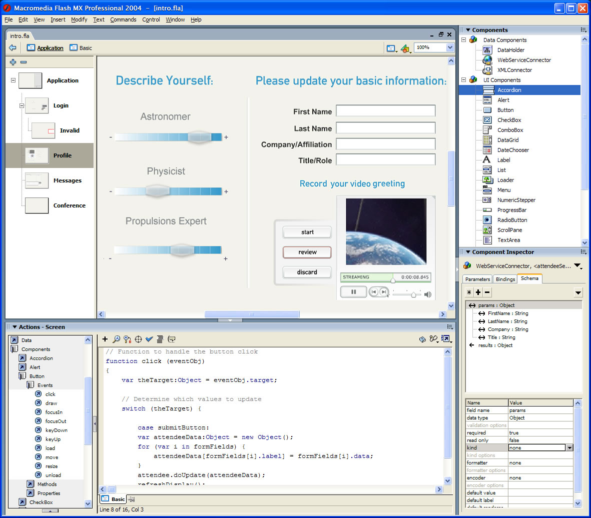
I designed features, made wireframes and comps, designed icons and splash screens, wrote and reviewed specs, and worked with multiple product teams to get them implemented—including localization support, Flash Streaming Video (.flv files), components for video and building applications, and more. I also designed components for video and data connectivity that had setup wizards built in to increase initial ease of use.
I successfully performed the first full UI audit of Flash, pairing with developers to fix UI bugs, reorganize menus, standardize keyboard shortcuts, and group UI by affinity and usage. Managed usability testing and alpha/beta testing programs. Created solutions for all major issues discovered in usability testing and UI audit.
Coordinated complete reskinning of the Flash application with the Flash engineering and QA teams, other Studio product teams, internal design standards group, and external design agencies.
Represented the voice of the customer. One of three core team members involved in all customer visits as part of synchronous development initiative for FlexBuilder.
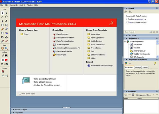
DRILLDOWN: Start Page
Intelligent Defaults are important. Beginning states are the easiest to optimize because behavior and state is least divergent at that point. Yet most software had nothing useful happen when you ran it. New users would see nothing helpful and constant users would have to go through sub-menus to reopen recent files. The best case was a popup that could be useful but felt as if it should be swatted away. I proposed a standard starting state for the app that exposed recent files for continuing work, common templates for new work, and tutorial files for new users. All of these could be kicked off with a single click from the unused space when no documents were open. Wrote specs for Start Page and worked with engineers, QA, and multiple product teams to get it implemented in all of the Macromedia Studio products including Flash, Dreamweaver, and Fireworks.
RESULTS
The start page concept was implemented in all of the Studio MX products and is still in all those products today.
The Flash Player achieved 98% market adoption and Flash streaming video won a Technical Emmy and enabled modern internet video experiences such as YouTube and Hulu.
The Studio product suite made over $400M.
NDC (McKesson)
“Formzilla” and eHospital
1999 – 2002
BUSINESS PROBLEM
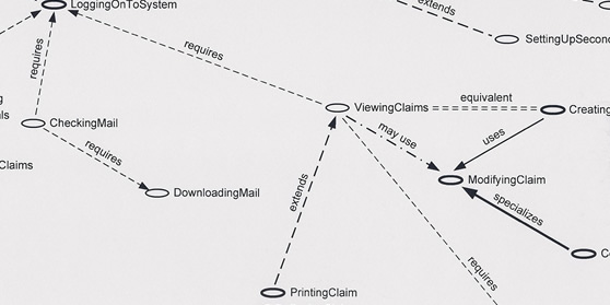
The showcase piece of a hospital software suite, “Formzilla” was our internal nickname for a potential development nightmare: multi-page information-dense medical claim forms, editable in the browser. And though Formzilla was a beast, it was only one part of a needed solution. NDC’s current Windows software suite required sending out stacks of disks every time insurance companies changed their rules—which was all the time. They had been experimenting with electronic distribution for years and I realized the time was ripe for a browser-based solution with the maturation of Flash and AJAX.
ROLE
Originally, software engineer but I proposed, built, and managed a UI/UX Team (front-end devs, designers, docs).
SOLUTION
I built a working prototype in Flash for Formzilla. Upon seeing a demo, upper management approved an entire next-gen rewrite of the suite. I was given responsibility for the UI layer. I defined, requested, recruited, and led a UX team of designers, UI developers, and technical writers. I established visual design standards, coding practices, and UX methodologies, and created a database-driven online tool to track UX requirements/specs and turn them into documentation and API calls.
I led contextual inquiry onsite in hospital billing offices and ran usability tests with internal subjects and external beta users. As a team, we created and prioritized personas, persona maps, use cases, use case maps, contexts, and APIs. I hired an external agency to set design direction then my team turned their artifacts into an online visual style guide and UI components for Flash and HTML. I also personally designed and coded Formzilla.
DRILLDOWN:
The on-premise legacy green-screen systems we were trying to displace were ugly and cumbersome but they were fast. I went back to the drawing board—the user’s goal. In this case, their main task was to correct errors. Instead of loading an entire claim form at once, I had the team break the loading into two parts: first, the error list; second, the entire claim. A good “biller” could fix all the errors in the error list in seconds without waiting for the entire form to load. System performance was technically much slower but their time-to-completion could actually be faster.
RESULTS
Prototype led to approval of entire project and staffing. Built the first user experience team at NDC. The UI layer of eHospital hit every milestone ahead of time and the product was a hit for NDC—eventually in use at over a thousand hospitals in the US. My work with “Formzilla” led to Macromedia hiring me to be the product designer for new Flash products.
Bands & Record Labels
1997 – 2000
BUSINESS PROBLEM
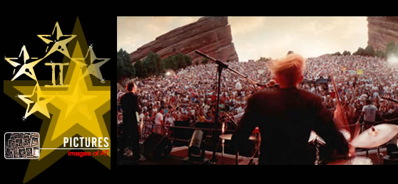
When my band signed to Universal Records, we needed a world-class website. A hired NY agency delivered nothing impressive, so I learned Flash and the record company hired me to do it.
ROLE
Flash and HTML designer/developer; singer, songwriter, and multi-instrumentalist
SOLUTION
Analyzed and documented what the band’s requirements were and what our fans’ goals were. Reviewed with all stakeholders. Built prototypes and proof-of-concepts for the pieces that were more innovative or risky. Mixed Flash and AJAX (“DHTML”) to create the website.
RESULTS
The site launched with a good reception from the fans, the record label, and the other band members. It turned out well enough that Universal asked me to do interactive song eCards and other bands asked me to develop their websites.
Then Napster and mp3-trading hit and the entire music industry imploded in slow motion.