Developer Overview of the User Interface for the 2007 Microsoft Office System
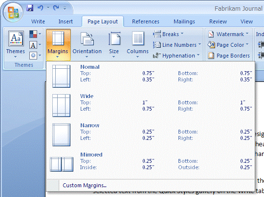
MSDN has a new article regarding the new UI for Office 2007 chock full of screen shots and explanations of what they did and why. As I’ve mentioned before, the Office team took a real risk with this and I hope they succeed–and not just because I own MSFT stock.
The longer a product stays around and the further down the version path it goes, the harder it is to change the UI, even when it’s fundamentally flawed. I was the product designer for Flash for a while and there was a lot of resistance internally and externally to any sort of UI change even when customers were clearly asking for somethign. This is one of the main reasons that you’re better off not adding a feature to a product until you really understand how people want to use it and can make sure you get it right.
But I digress… the reason I actually hope this succeeds is two-fold. First, There’s been very little user interface progress IMO in the last decade. The web, in fact, really took us several steps *back* as far as UI functionality goes. We’re only now with AJAX getting anywhere near where we were with the desktop ten years ago. And even with the desktop, I actually think that most of what we take for granted in UI like scrollbars and menus are really poor experiences. For office to get rid of menus altogether is a grand experiment and I hope it succeeds. The second reason I hope it’s successful and that it works well is that so many developers copy whatever Office does–how about that Outlook tab pane? And the point isn’t about who *invented* that UI–for all I know, the ribbon bar could’ve been part of some secret project at Xerox PARC thirty years ago. The point is that when Microsoft does something, many developers and businesses follow. So if Microsoft innovates on its user interfaces it raises the bar for everyone.
