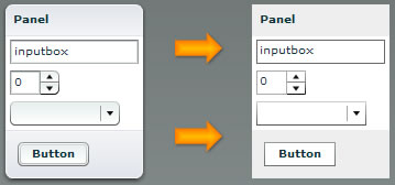
What:
I created a stylesheet that turns any mxml app into a wireframe. This allows you to wireframe using real components.
Why:
- To keep prototypes looking like prototypes, avoiding premature discussion about Halo look and feel.
- Using flex for the wireframes help insure that they are technically feasible. Designers build familiarity with Flex.
- Save time wireframing by using the automatic layout features of flex.
- Reuse the UI layout effort in wireframing to save time at implementation—just remove the stylesheet or replace with a production one and you have a styled flex UI.
- Allows for wireframes that actually *work*–can be interacted with. You can now “wireframe” the interaction design work without needing to create a Flash animation mockup.
How:
If you’re using FlexBuilder for wireframing, just use the Design panel > CSS tab > Attach StyleSheet button to add the wireframe.css to your app. Or under the application tag just add the style tag:
< mx:Style source="../Wireframes/wireframe.css" />
(where ../Wireframes/ is the path to this css file) and the entire app will inherit these styles. Note that if you are overriding this elsewhere, the more localized styles will override the wireframe styles—wireframing is usually happening long before styling so this shouldn’t be a problem.
You can download it here.
This is just a first rough draft that I’ve been using. If you use this at all, let me know if it works for you and if there are any improvements needed.