McKesson (NDC)
“Formzilla” and eHospital
1999 – 2002

BUSINESS PROBLEM
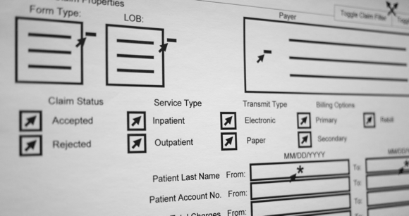
The showcase piece of a hospital software suite, “Formzilla” was our internal nickname for a potential development nightmare: multi-page information-dense medical claim forms, editable in the browser. And though Formzilla was a beast, it was only one part of a needed solution. NDC’s current Windows software suite required sending out stacks of disks every time insurance companies changed their rules—which was all the time. They had been experimenting with electronic distribution for years and I realized the time was ripe for a browser-based solution with the maturation of Flash and AJAX.
ROLE
Originally, software engineer but I proposed, built, and managed a UI/UX Team (front-end devs, designers, docs).
SOLUTION
I built a working prototype in Flash for Formzilla. Upon seeing a demo, upper management approved an entire next-gen rewrite of the suite. I was given responsibility for the UI layer. I defined, requested, recruited, and led a UX team of designers, UI developers, and technical writers. I established visual design standards, coding practices, and UX methodologies, and created a database-driven online tool to track UX requirements/specs and turn them into documentation and API calls.
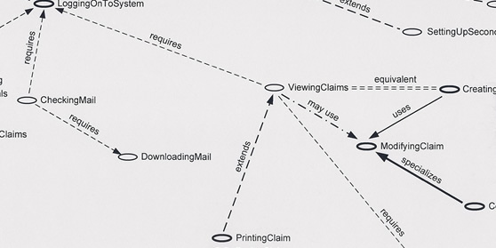
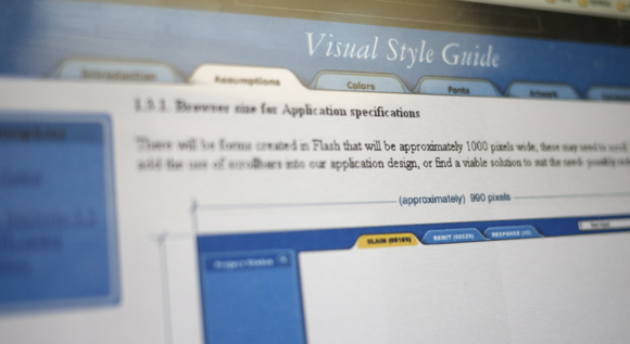
I led contextual inquiry onsite in hospital billing offices and ran usability tests with internal subjects and external beta users. As a team, we created and prioritized personas, persona maps, use cases, use case maps, contexts, and APIs. I hired an external agency to set design direction then my team turned their artifacts into an online visual style guide and UI components for Flash and HTML. I also personally designed and coded Formzilla.


DRILLDOWN:
The on-premise legacy green-screen systems we were trying to displace were ugly and cumbersome but they were fast. I went back to the drawing board—the user’s goal. In this case, their main task was to correct errors. Instead of loading an entire claim form at once, I had the team break the loading into two parts: first, the error list; second, the entire claim. A good “biller” could fix all the errors in the error list in seconds without waiting for the entire form to load. System performance was technically much slower but their time-to-completion could actually be faster.
RESULTS
Prototype led to approval of entire project and staffing. Built the first user experience team at NDC. The UI layer of eHospital hit every milestone ahead of time and the product was a hit for NDC—eventually in use at over a thousand hospitals in the US. My work with “Formzilla” led to Macromedia hiring me to be the product designer for new Flash products.